What a Great Therapist Website Actually Looks Like (Two Real Examples)
If you've ever Googled "therapist website examples" hoping to find something that felt genuinely useful — not just a gallery of pretty pages with no context — this post is for you.
I'm Ashley, a former corporate marketing leader, currently a grad student in a counseling program working toward my LPC. I am not a therapist, not pre-licensed, just someone who understands this world from both sides and builds websites specifically for therapists and mental health practitioners. Here are two real sites I built, what went into them, and what you can take away for your own practice.
Example 1: Morgan Gross Counseling
The brief: Invite someone who's struggling feel safe enough to reach out.

A therapy website has one job. Not to impress. Not to win design awards. Not to explain every modality you're trained in. Its job is to make the person who lands on it — probably anxious, probably exhausted, probably a little scared to ask for help — feel safe enough to take the next step.
Every decision we made came back to that moment. Morgan wanted something grounded. Calming. grounded, the kind of site that feels a little lived in, like a therapy office that's clearly been loved. Not sterile, not overly polished. Real. The soft palette, the unhurried copy, the form language that doesn't feel clinical or cold — all of it was in service of that feeling. We built a site that feels like Morgan: warm, steady, and genuinely collaborative.
Here's what's actually under the hood:
Telehealth intake flow. Not just a contact form. A structured path that walks potential clients through what to expect, reducing the friction between "I need help" and "I booked a session."
Session type breakdowns. Clear, specific, no jargon. Clients shouldn't have to guess whether you offer what they need.
A fees & FAQs page that actually answers the question. This is one of the highest-traffic pages on most therapy websites, and most of them either don't exist or are vague to the point of uselessness. Morgan's answers the real questions people are afraid to ask.
Mobile-first throughout. Most therapy clients are finding you on their phone, probably at night, probably in bed. The site was designed for that moment.
A scrolling brand marquee that grounds the whole thing and reinforces her practice values without a wall of text.
Simple on the surface. A lot of intention underneath.
Example 2: Matter Collaborative
The brief: One practice. Three distinct worlds.
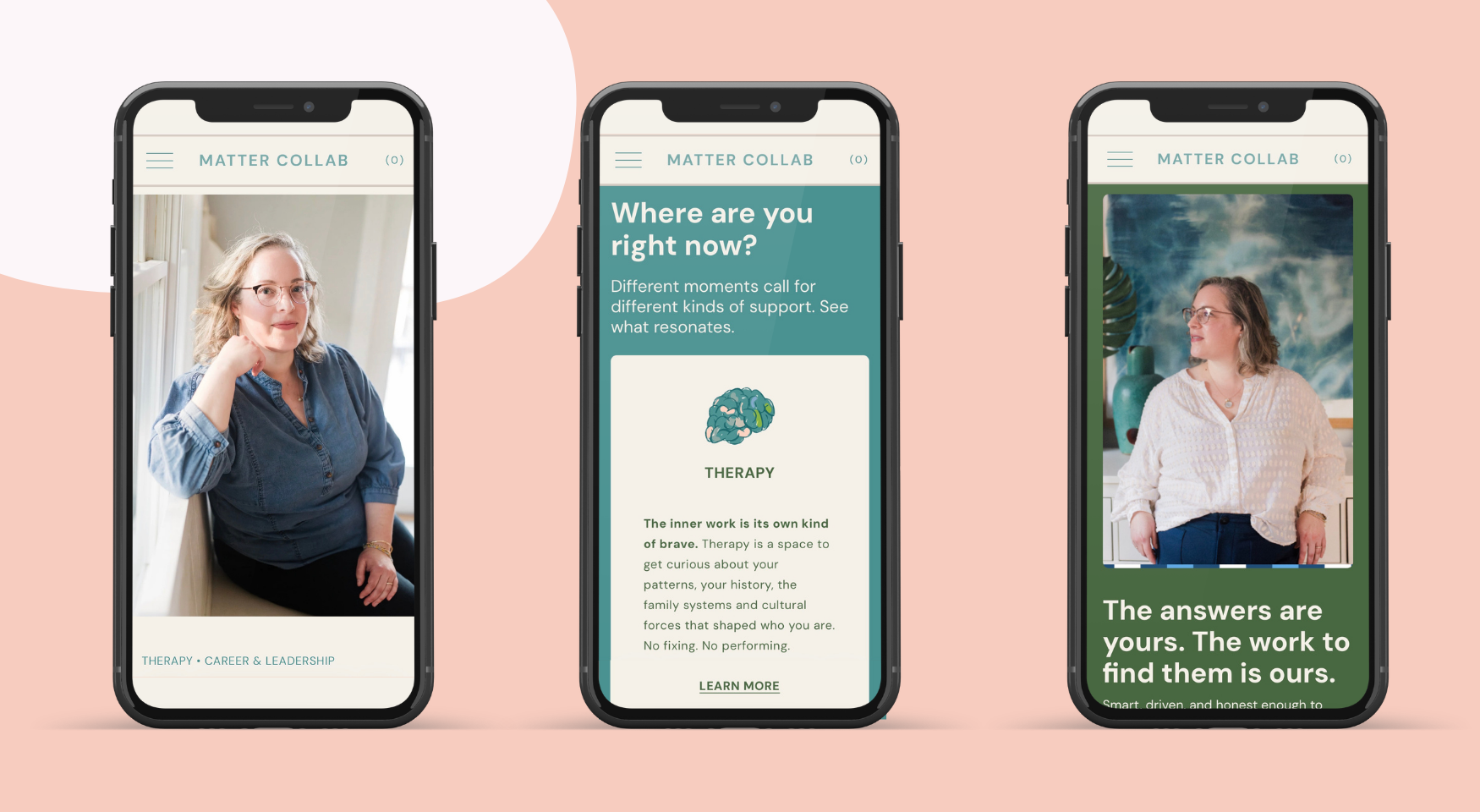
Not every therapist has a simple practice. Some of you are doing multiple things: therapy, coaching, consulting, speaking, selling resources… and trying to squeeze all of that onto one generic "About Me" page is doing none of it justice.
That was the challenge with Matter Collaborative. Mollie knew exactly who she was — confident, distinct, clear on her value — but she also wanted the site to feel genuinely human. Not corporate. Not cold. Confident and warm at the same time, which is honestly one of the harder balancing acts in web design. She offers coaching, therapy, and consulting, three services with different ethical obligations, different audiences, and different tones. A client looking for therapy needs to feel something different than a corporate client looking for consulting. Treating them the same on a website is a missed opportunity at best, a credibility problem at worst.
So we built them as three distinct worlds under one brand.
Each section has its own visual identity. Different color cues, different imagery treatment, different feel — but cohesive enough that it's clearly one practice. The brand holds it together even as the tone shifts.
Each has its own copy tone and client journey. The therapy section leads with safety and relationship. The coaching section leads with growth and accountability. The consulting section leads with expertise and outcomes. Same person, different hats, different conversations.
A full shop. Resources, materials, and offerings that create revenue outside of 1:1 sessions — which, given the insurance reimbursement landscape, matters more than ever.
Brand refresh, logo refinement, SEO, social share cards, and domain migration. This was one of the most complex builds I've done. Worth every late night.
The takeaway here isn't that your website needs to be this complex. It's that your website needs to match the actual complexity of your practice. If you're doing multiple things, trying to simplify them into one vague paragraph isn't clarity. It's invisibility.
What Both Sites Have in Common
They look completely different. They serve completely different practices. But they share the same foundation:
Specificity. Neither site could have been written for someone else. Morgan's site sounds like Morgan. Mollie's site sounds like Mollie. That's not an accident — it's the whole point.
Intentional client journeys. Every page has a job. Every section moves someone closer to taking action or helps them self-select out. Both are good outcomes.
Mobile-first design. Your clients are on their phones. Your website needs to meet them there.
Copy that serves the client, not the clinician. It's not about listing your credentials. It's about making the right person feel found.
If you're looking at your own website right now and something feels off — too generic, too flat, not quite you — that feeling is worth listening to. Your website should feel as specific and intentional as the work you do in session.
That's what we build.
Ashley Rhoden is a former corporate marketing leader turned strategist and website designer who works with therapists and private practice owners ready to stop being invisible online. She's also a grad student in a counseling program — not a therapist, not pre-licensed, just someone who understands this world from both the marketing side and the inside of a counseling program, and brings both to every website she builds.
Work with her to build a website that’s as unique as your sessions are. →